Pokédex App Design
Concept
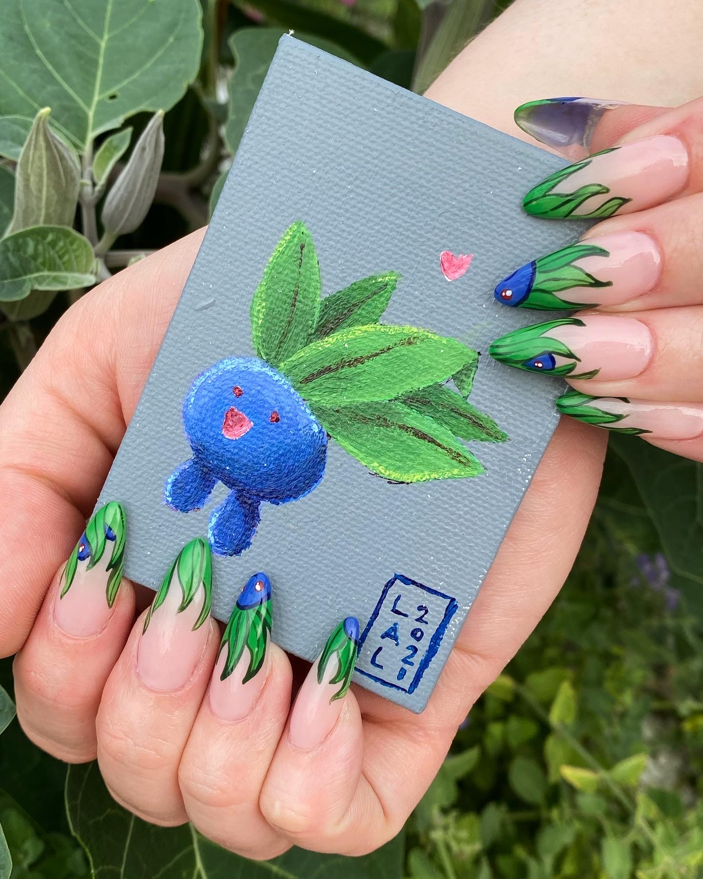
A friend of mine is a nail artist and has a personal goal to paint every Pokémon, but her current method of tracking her progress — manually crossing out images saved as Instagram Story Highlights — is tedious, time consuming, and difficult to search if you are not immediately familiar with the entire franchise.
Thinking, “there’s gotta be a better way!” I started brainstorming about building a website or mobile app that could index, filter, and track her progress. I began with key functions I wanted the app to have:
- Minimalist content to focus on the art
- Multiple ways to browse / filter / search
- Completed / uncompleted
- Pokémon generation / region
- Pokémon type
- Favorites
- Social integration — user profiles, add favorites, sharing to other apps
I also knew I wanted to keep the style of the app very reminiscent of the games: bold, primary colors; retro pixel fonts; text-based menus. I reviewed the Pokédex designs from each game and began to identify what did and did not work from each generation to combine all the best design elements into my app.

User flow

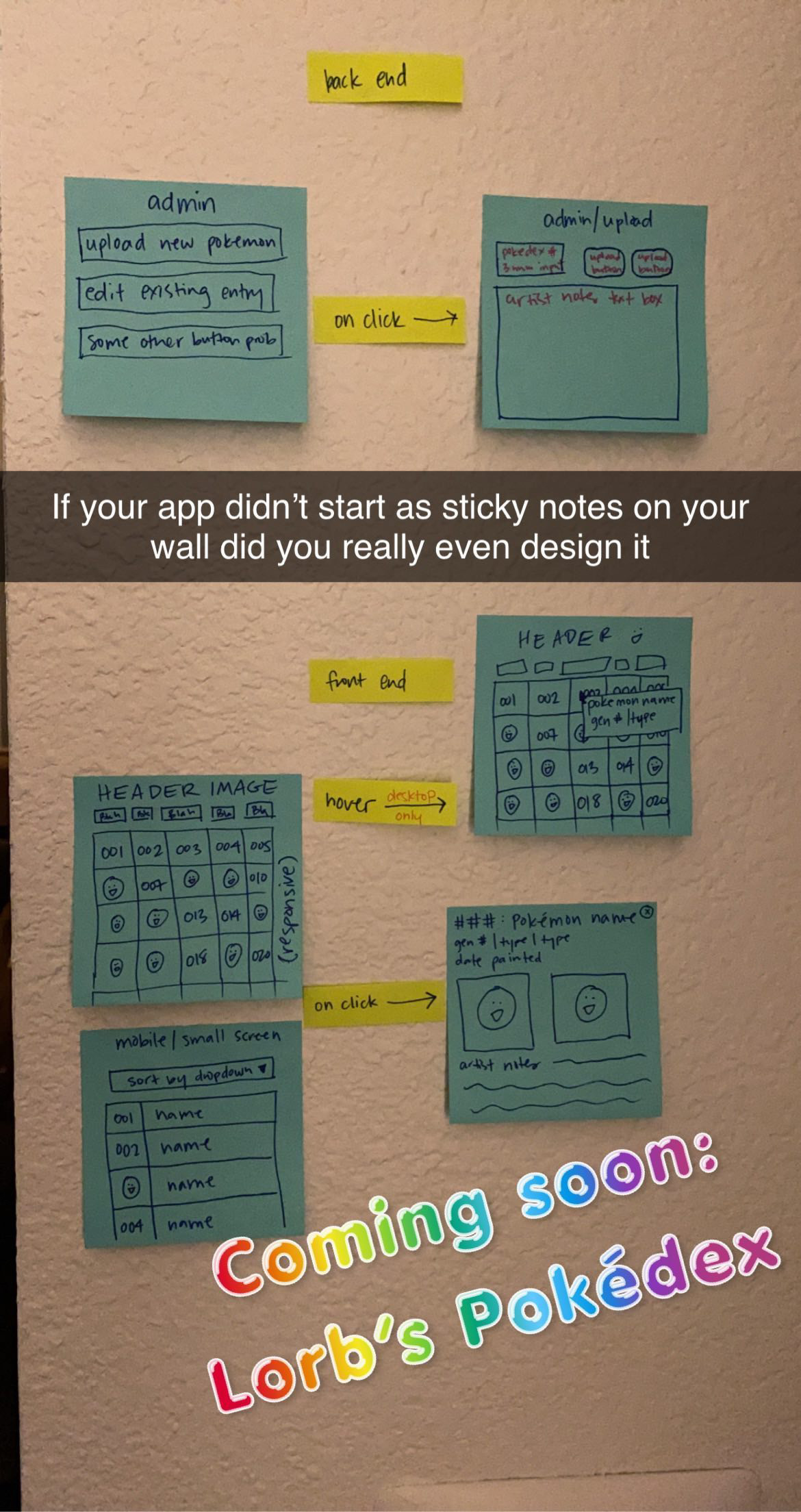
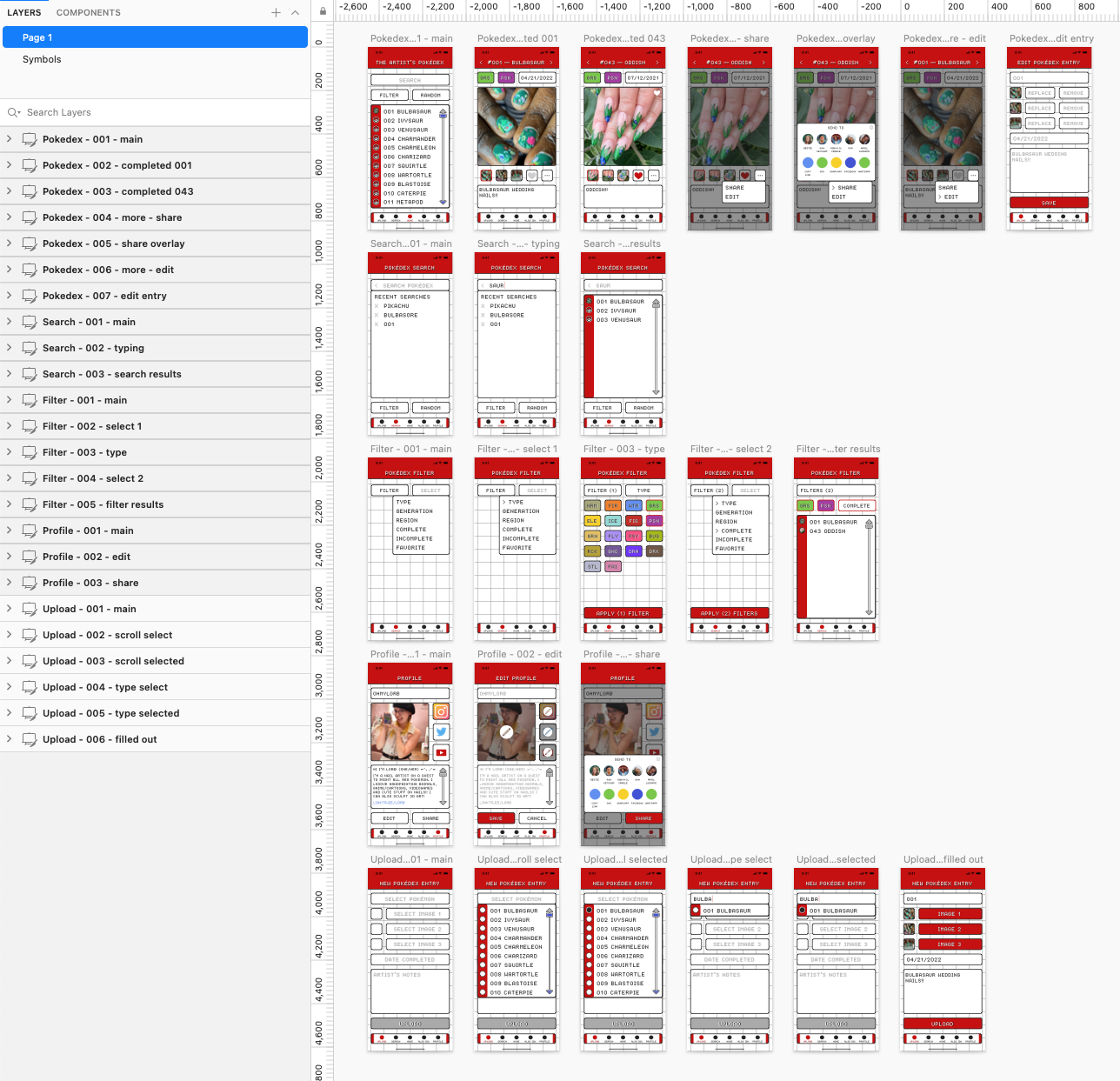
Once I had the minimum viable product roughed out out in my head, I began to map out the app flow using sticky notes. The app itself is extremely simple with only a handful of different functionalities — browse, upload, or share — so there’s not a lot of different sections that needed to be mapped out and I was able to quickly brought the roughs into Sketch to begin wireframing.
Because I already knew the overall aesthetic I was going for, I completely skipped the bare-bones wireframe stage and immediately designed almost the entire finished UI during this stage of the process.


